Top Cloud Business Intelligence Tools for FinOps, Data & Analytics (2026)
Your cloud bill tells you what you spent last month. Cloud BI tools tell you why — and whether that spend actually drove results. But here’s the thing: “cloud BI” can mean radically different things depending on who you ask. A VP of Engineering looking at Tableau dashboards and a FinOps lead optimizing Savings Plans coverage are both doing “cloud business intelligence,” but they need completely different tools.
We’ll cover what cloud BI actually means in 2026, the specific metrics worth tracking (with real formulas), and how to pick tools that match your actual situation — whether you’re a startup burning through $50K/month on AWS or an enterprise managing hundreds of accounts across three providers.
What Is Cloud Business Intelligence?
Cloud business intelligence is the practice of using cloud-hosted analytics platforms to turn operational and financial data into decisions. No on-prem servers, no managing your own ETL infrastructure. The platform handles storage, compute, and availability — you build dashboards and reports on top.
That’s the textbook definition. In practice, cloud BI breaks into two camps that rarely talk to each other.
The first camp is general-purpose BI. Tools like Tableau, Power BI, and Looker connect to cloud-hosted data warehouses and let teams build visualizations across any business domain — sales funnels, marketing attribution, product usage, whatever. These tools don’t care whether your data lives in AWS, Azure, or a Postgres database. They just make it visual.
The second camp is FinOps-oriented BI. Platforms like nOps, AWS Cost Explorer, and CloudZero are purpose-built for cloud financial management. They ingest billing data directly from cloud providers, understand commitment discount structures — Reserved Instances (RIs), Savings Plans (SPs), Spot pricing — and provide cost allocation, anomaly detection, and optimization recommendations. These aren’t general analytics tools. They’re specialized instruments for a very specific problem.
Most growing cloud-native companies end up needing tools from both camps. The trick is knowing which to prioritize.
Why Cloud Business Intelligence Tools Matter in 2026
Two forces are making BI tool selection more challenging right now:
Cloud waste just reversed its five-year decline. The Flexera 2026 State of the Cloud Report pegged estimated wasted IaaS and PaaS spend at 29% — up after years of steady improvement. The culprit? AI workloads. GenAI usage hit 58% of public cloud services (up from 50%), and these workloads are unpredictable. They spike, they scale in weird patterns, and they don’t fit neatly into existing commitment structures. Traditional BI dashboards can show the spike. FinOps tools can do something about it.
More types of cloud spending to juggle. The FinOps Foundation’s 2026 State of FinOps report showed that 90% of respondents now manage SaaS spend or plan to (up from 65% in 2025), 64% manage licensing, 57% manage private cloud. FinOps isn’t a cloud-cost discipline anymore. It’s a technology value discipline. Your BI tools need to support that broader scope.
Key Metrics Cloud Business Intelligence Tools Should Track
Let’s get specific on the key metrics and KPIs teams should be tracking.
Cost Metrics
Cost per Customer = Total Cloud Spend Attributed to Customer ÷ Active Customers. Say your platform serves 10,000 customers on $500K/month of AWS — that’s $50/customer/month. When this number creeps up without a corresponding feature launch or traffic increase, you’ve got margin erosion. Track it monthly at minimum.
Infrastructure Spend as % of Revenue = Total Cloud Spend ÷ Gross Revenue × 100. Most SaaS companies target 15-25%. Drift above 30% and your unit economics start breaking down. Below 10% might mean you’re underinvesting in reliability or performance.
Commitment Coverage Rate = Committed Spend (RIs + SPs) ÷ Total Eligible Spend × 100. Strong teams sit at 70-80%. One nOps customer recently discovered their R6a instance coverage was falling short — they had commitments, but usage had shifted to newer instance families without coverage following. That’s a gap a basic dashboard won’t catch.
Effective Savings Rate (ESR) = (What you’d pay on-demand − What you actually paid) ÷ What you’d pay on-demand × 100. This is the single best measure of commitment portfolio health. It captures the combined impact of RIs, SPs, Spot, and negotiated rates.
Performance Metrics
Revenue per Cloud Dollar = Revenue ÷ Total Cloud Spend. If this ratio drops quarter over quarter, you’re scaling infrastructure faster than the business — a conversation every CFO wants to have, preferably before it becomes a trend.
Customer Retention Cost = Cloud Spend on Retention Infrastructure ÷ Retained Customers. Helps justify investments in monitoring, performance, and reliability. Hard to calculate without solid cost allocation, but worth the effort.
Operational Efficiency Metrics
Idle Resource Rate = Cost of Idle Resources ÷ Total Compute Spend × 100. Target below 5%. A lot of teams are running at 15-20% idle and don’t even know it — EC2 instances averaging 3% CPU, unattached EBS volumes accumulating storage charges, load balancers sitting in front of nothing. Your BI tool should surface these automatically.
Right-Sizing Adoption Rate = Recommendations Acted On ÷ Total Recommendations × 100. If your tool generates 200 recommendations and your team implements 30, that’s 15%. The problem usually isn’t the recommendations — it’s the implementation workflow. Teams that integrate right-sizing into their Terraform or IaC pipelines see much higher adoption.
Predictive Insights
Spend Forecast Accuracy = 1 − (|Forecast − Actual| ÷ Actual) × 100. Good tools hit 90-95% accuracy 30 days out. Beyond 90 days, treat forecasts as directional, not gospel.
Commitment Expiration Risk = Expiring Commitments (Next 90 Days) ÷ Total Commitment Value × 100. One customer recently flagged $200/hour in SPs expiring — that’s roughly $736,000 in annual savings at risk if renewals slip. A FinOps BI tool should alert you well before expiration hits.
Migration Coverage Tracking. When teams migrate instance families — say, moving from C6a to C7a Graviton — existing commitments don’t automatically follow. You need visibility into which commitments cover which workloads, and what happens to coverage when architectures change.
Data Quality Metrics
Tagging Compliance Rate = Tagged Resources ÷ Total Resources × 100. As one r/aws thread put it: “Everyone says ‘tag your resources’ for cost control. Nobody explains how to actually do it well.” Target 90%+ before you trust your cost allocation numbers.
Attribution Accuracy = Correctly Allocated Costs ÷ Total Costs × 100. If 30% of your spend sits in an “unallocated” bucket, every cost-per-customer and cost-per-product number is suspect. Fix allocation before investing in fancier analytics.
Types of Cloud Business Intelligence Tools
Cloud BI tools break into five categories. Most organizations need tools from at least two:
| Category | Purpose | Best For | Examples |
|---|---|---|---|
| Cloud Cost Intelligence / FinOps BI | Ingest billing data, optimize commitments, reduce waste | Teams with $10K+/month cloud spend | nOps, CloudZero, AWS Cost Explorer |
| Data Warehousing | Store and query large datasets | Custom analytics pipelines | Snowflake, Redshift, Databricks |
| Data Visualization & Reporting | Build dashboards from any data source | Executive reporting, cross-team analytics | Tableau, Power BI, Looker |
| Predictive Analytics | Forecast trends using ML and statistics | Demand planning, risk modeling | SAS Analytics, IBM Cognos |
| Data Integration & Cleansing | Connect and normalize fragmented data | Teams with 5+ data sources | Integrate.io, Ringlead Cleanse |
Top Business Intelligence Tools by Category
Let’s break down each type of Cloud BI tool:
Cloud Cost Intelligence and FinOps BI Tools
These platforms ingest cloud billing data natively. They don’t just display numbers — they understand cloud pricing mechanics (RI discounts, SP coverage, Spot markets, tiered pricing) and can recommend or execute actions based on what the data shows.
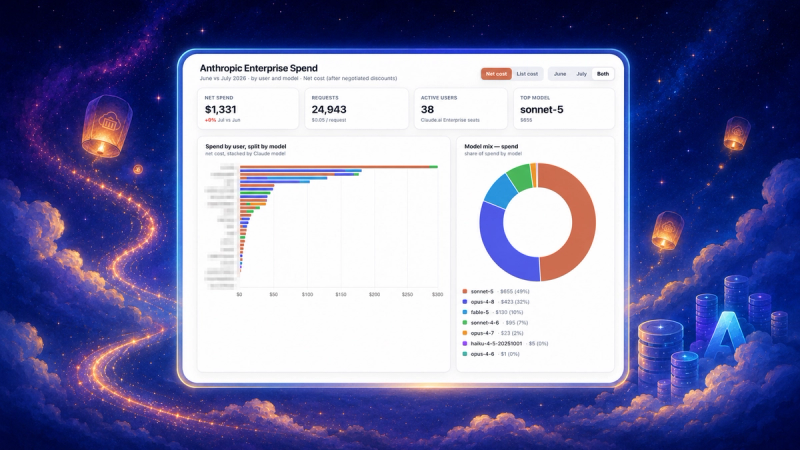
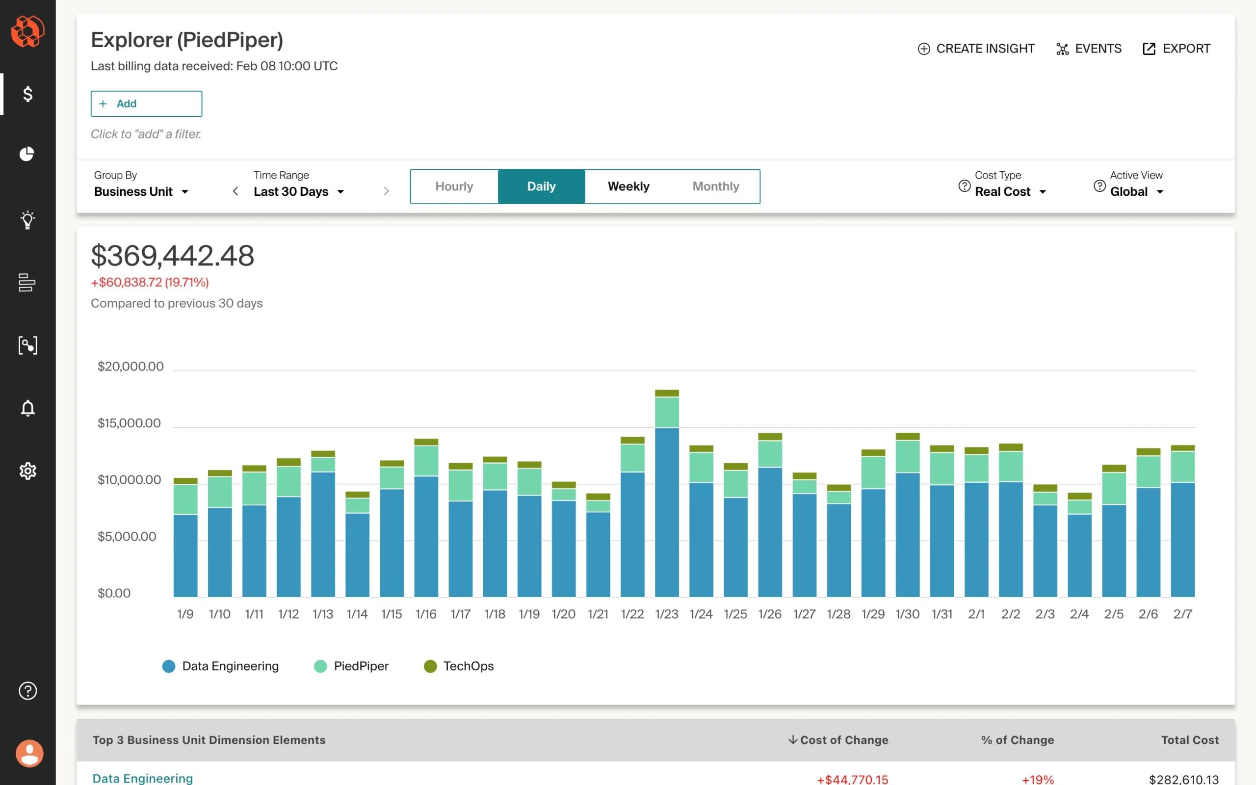
nOps combines cost visibility with automated optimization — it’s both the BI layer and the action layer. It offers visibility, cost allocation, reports, forecasting and anomaly detection across multicloud, Kubernetes, SaaS and AI. Commitment Management purchases RIs and SPs in small, adaptive increments that follow actual usage patterns, maximizing both savings and flexibility for variable workloads. Pricing is savings-first — you pay nothing until nOps delivers measurable savings.

CloudZero maps cloud costs to business dimensions — customers, products, features, engineering teams. It’s strong on unit economics: if you need to know cost per customer or cost per deployment at a granular level, CloudZero’s allocation engine handles that. It’s a visibility and analytics platform, though — it shows you the numbers but doesn’t manage commitments or execute optimization actions. You’ll need a separate tool for that.
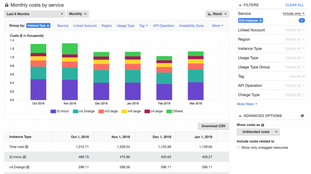
AWS Cost Explorer ships free with every AWS account and handles basic cost visibility well. Spend breakdowns by service, account, tag. Simple forecasting. RI and SP recommendations. For a team just getting started with cost management, it’s the obvious first step. Where it falls short: 24-hour data delay, limited customization, no automated action, and it’s AWS-only. You’ll outgrow it when you hit 10+ accounts or need real-time anomaly detection.
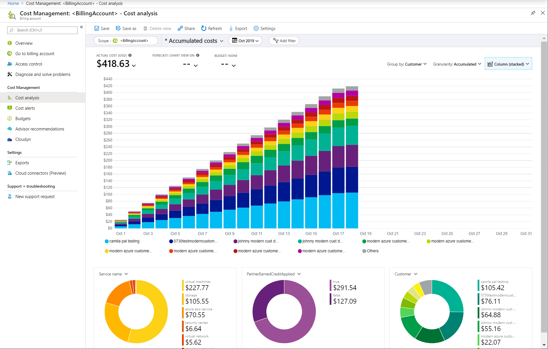
Azure Cost Management fills the same role for Microsoft shops. Cost analysis, budgets, advisor recommendations for right-sizing and RI purchases — all built into the Azure portal. Solid for single-cloud Azure environments. Same limitations as Cost Explorer: no cross-cloud support, no automated commitment management, limited depth for complex multi-account setups.
Data Warehousing Tools
These store the raw data that BI tools query. They’re the engine room underneath the dashboards.
Snowflake separates compute from storage, so you can scale analytical queries independently from data volume. Multi-cloud support (AWS, Azure, GCP) and consumption-based pricing. Used widely for custom analytics pipelines where teams need full control over data modeling. Just watch your credit consumption — unoptimized queries can get expensive fast.
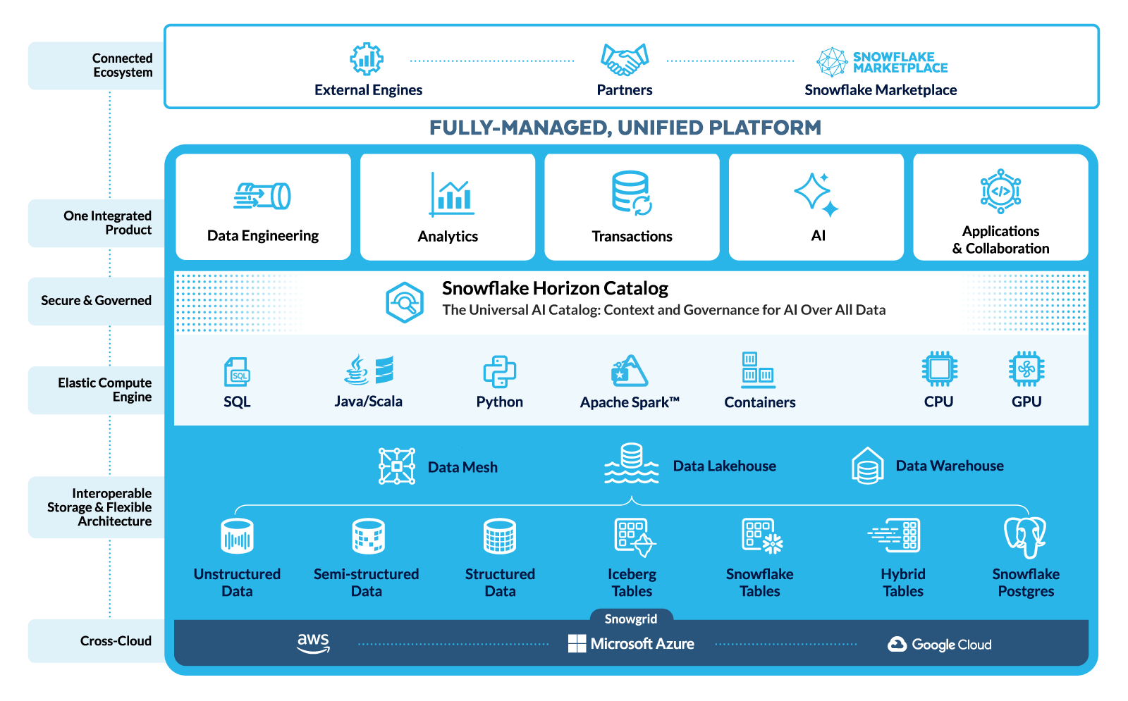
Amazon Redshift is AWS’s managed warehouse, best for teams already deep in the AWS ecosystem. Redshift Serverless offers pay-per-query pricing for intermittent workloads. Recent Top-K query optimizations improved performance for common analytical patterns. Petabyte-scale, but migration from Redshift to another warehouse is painful if you ever leave AWS.
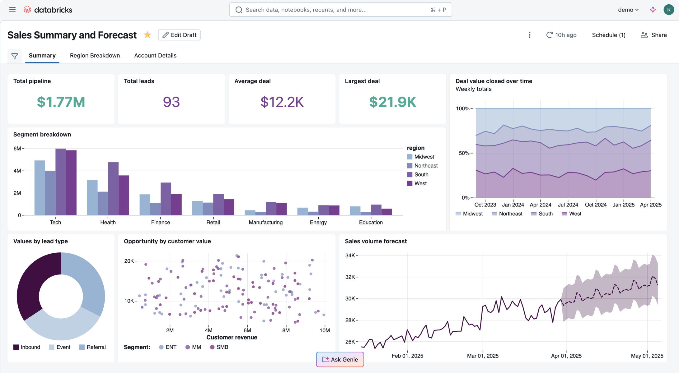
Databricks runs a unified lakehouse that handles both BI analytics and ML/data science workloads. Built on Spark. If you need ETL, data engineering, and predictive modeling alongside traditional reporting, Databricks consolidates multiple tools into one platform. Steeper learning curve for pure BI compared to Snowflake or Redshift.
Data Visualization and Reporting Tools
The layer that makes data accessible to people who don’t write SQL.
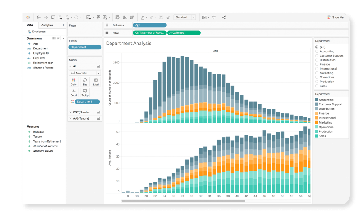
Tableau is still the data visualization benchmark — drag-and-drop interface, broad data source connectivity (warehouses, databases, spreadsheets, SaaS platforms), strong ad-hoc exploration. Since the Salesforce acquisition, enterprise pricing has climbed, and licensing complexity has become a real friction point for some teams.
Microsoft Power BI delivers competitive BI at $10/user/month for Pro, with deep hooks into Azure, Excel, Teams, and SharePoint. Gartner Peer Insights consistently rates it among the top platforms. If your organization already runs on Microsoft 365, Power BI is the path of least resistance. It struggles more with non-Microsoft data sources and large-scale embedded analytics.
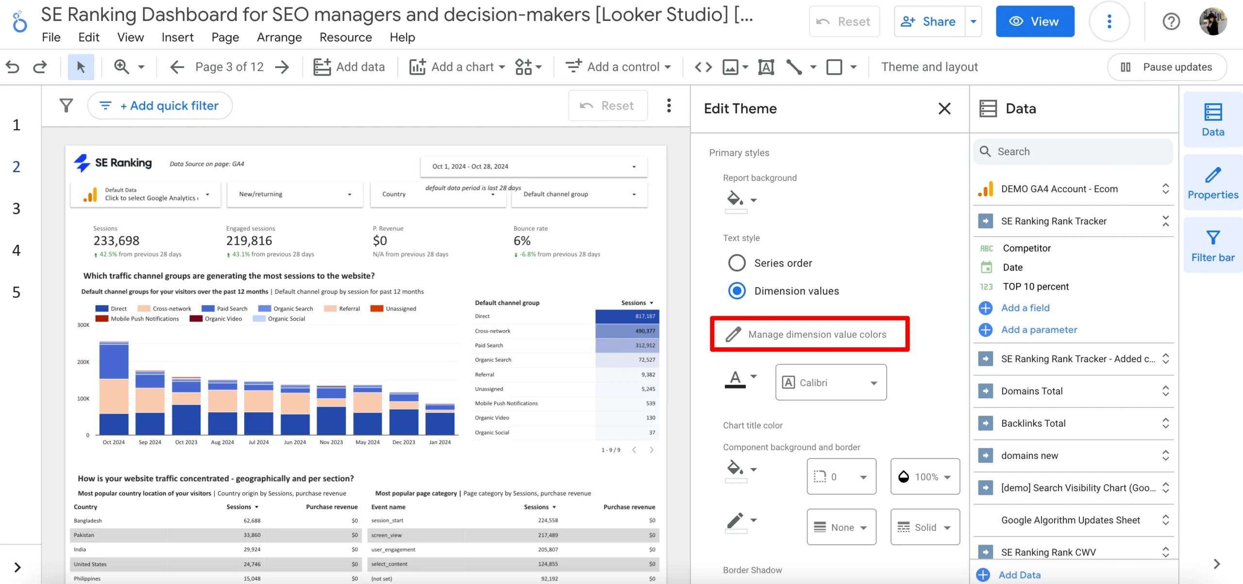
Looker takes a code-first approach with LookML, a modeling language that lets data teams define metrics centrally. When “revenue” is defined once in LookML, every dashboard in the org uses the same number. Strong data governance, tight Google Cloud/BigQuery integration. The trade-off: self-service is harder for business users who can’t write LookML, and you’re somewhat locked into the Google ecosystem.
Predictive Analytics Tools
Beyond historical reporting — forecasting, pattern detection, scenario modeling.
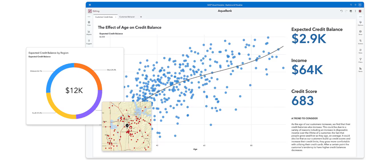
SAS Analytics is the enterprise standard for statistical modeling and ML in regulated industries. Finance teams, healthcare orgs, government agencies — they use SAS because it provides the auditability and methodological rigor those environments demand. Not cheap, not simple, but deeply capable for complex predictive work.
IBM Cognos Analytics blends traditional reporting with AI-assisted data exploration. Users can ask questions in natural language and get automated data visualizations — useful for teams without dedicated data analysts. Cognos handles hybrid environments (cloud + on-prem) well, which matters for enterprises mid-migration.
Data Integration and Cleansing Tools
These tools handle the foundational work of connecting and cleaning data before it hits your BI layer.
Integrate.io provides no-code ETL and reverse ETL pipelines. If you need to pull data from Salesforce, Stripe, AWS billing, and a Postgres database into Snowflake for data analysis, Integrate.io builds that pipeline without requiring a data engineer. Useful for small-to-mid teams that can’t dedicate engineering resources to data plumbing.
Ringlead Cleanse specializes in data deduplication and normalization — primarily CRM and marketing data. Narrow scope, but it solves a problem that matters: if your customer database has duplicates, your cost-per-customer numbers are wrong. Clean the data first, analyze second.
How to Choose the Right Cloud BI Tool
If you’re choosing among tools, here are the key considerations:
Startup vs. Enterprise
Startups (<$100K/month cloud spend): AWS Cost Explorer plus Power BI covers a lot of ground for minimal cost. Add a dedicated FinOps tool when monthly spend crosses $10K and commitment management starts moving the needle.
Enterprises ($100K+/month): You’re managing multiple layers of cloud cost and business intelligence at once. A platform like nOps can serve as the FinOps system of action for cost visibility, allocation, commitment optimization, forecasting, and automated savings, while warehouses and BI tools support advanced analytics and executive reporting. The challenge is building a stack that not only explains spend, but continuously improves it.
Data Maturity Level
Early (basic tagging, spreadsheet tracking): Focus on cost allocation first. A FinOps tool that enforces tagging policies and delivers out-of-the-box dashboards will produce more ROI than a powerful warehouse you can’t populate with clean data. Get attribution accuracy above 85% before investing in advanced analytics.
Mature (consistent tagging, automated pipelines, unit economics): Layer in predictive analytics and custom queries. You have the data quality to support spend forecasting, capacity planning, and cost-per-customer trending with confidence.
Single-Cloud vs. Multi-Cloud
Single-cloud: Native tools handle the basics well. AWS Cost Explorer plus QuickSight, or Azure Cost Management plus Power BI. Add a FinOps platform when you hit 10+ accounts, need container-level allocation, or your commitment portfolio gets complex enough that manual management isn’t realistic.
Multi-cloud: You need a platform that normalizes billing and usage data across providers. The FinOps Open Cost and Usage Specification (FOCUS) is gaining traction as a standard here. Multicloud visibility platforms can unify multi-cloud cost visibility, allocation, forecasting, and optimization in one place, while general BI tools like Tableau can sit on top for broader reporting.
BI vs. FinOps Use Case
Ask this: Do I need to understand my business data better, or reduce my cloud bill?
If it’s business intelligence — dashboards, KPIs, self-service analytics — go with Tableau, Power BI, or Looker plus a data warehouse.
If it’s cloud financial management — commitment optimization, waste reduction, cost allocation — go with nOps.
If it’s both (and for cloud-native SaaS companies, it usually is) — run a FinOps platform for the optimization layer and feed its data into a general BI tool. That’s how you get cost per customer alongside customer lifetime value in the same executive dashboard.
Maximize Cloud Business Intelligence with nOps
We built nOps to support the cloud business intelligence use cases discussed in this article — not just showing teams what they spent, but helping them understand, allocate, forecast, and optimize cloud costs in one place. For organizations that need more than dashboards, nOps combines FinOps visibility with automated action.
- Eliminate commitment risk: nOps shortens commitment windows from years to a fraction of the time, leveraging advanced strategies like dynamic seeding, layering, and squishing.
- Maximize savings on autopilot: nOps continuously adjusts commitments every hour to match real usage, helping customers capture incremental savings that slower optimization approaches can miss. Savings are often 20% higher than competitors.
- Savings-first pricing model: You don’t pay us until we’ve delivered measurable cost savings. No upfront platform fees, no percentage-of-spend charges, no premiums.
nOps offers a free savings assessment, so you can see exactly how much you can save while eliminating commitment risk.
nOps was recently ranked #1 in G2’s Cloud Cost Management category and manages $4 billion in multicloud spending.
Demo
AI-Powered Cost Management Platform
Discover how much you can save in just 10 minutes!
Book a Demo
Frequently Asked Questions
Let’s dive into a few frequently asked questions about cost data analysis, cloud BI solutions, data security and getting actionable insights to optimize your cloud bill.
What's the difference between cloud BI and traditional BI?
Traditional BI requires on-premises servers your team maintains, with fixed capacity and manual upgrades. Cloud business intelligence software is provider-hosted, auto-scaling, and accessible from anywhere. The real difference is speed to insight — cloud BI removes the infrastructure bottleneck so teams analyze data instead of managing servers.
Do I need a separate FinOps tool if I already use Tableau or Power BI?
For cost optimization, yes. General BI tools display cloud cost data but don’t understand commitment discount structures, can’t purchase Savings Plans, and won’t generate right-sizing recommendations. Tableau shows what you spent. A FinOps tool like nOps reduces what you spend and helps you easily understand your costs with interactive dashboards.
How much cloud spend justifies a dedicated FinOps BI tool?
Typically around $10K/month, especially once cloud costs start needing active allocation, forecasting, or commitment tracking rather than simple monthly review. At that level, even modest optimization gains can justify the investment, and the bigger benefit is often better visibility and faster decision-making rather than savings alone.
What single metric matters most for cloud business intelligence?
Depends on who you are. Finance cares about cost per customer and cloud infrastructure spend as a percentage of revenue. Engineering watches idle resource rates and right-sizing adoption. Executives track revenue per cloud dollar. The best setup connects all of these.