Skip to content

- Blog
- Announcement
- Visualize Cost Hotspots with the New Heat Map
Visualize Cost Hotspots with the New Heat Map
Gain unified visibility into Fastly costs and usage
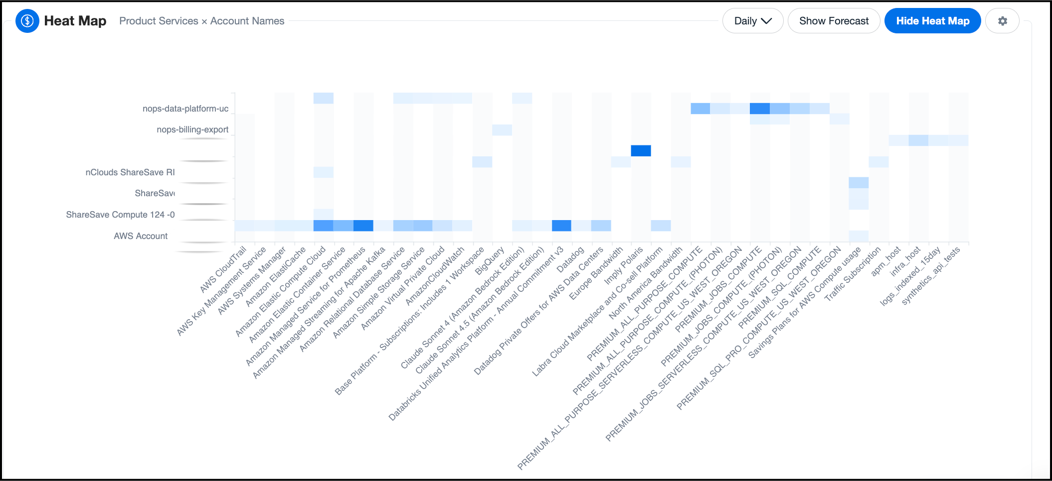
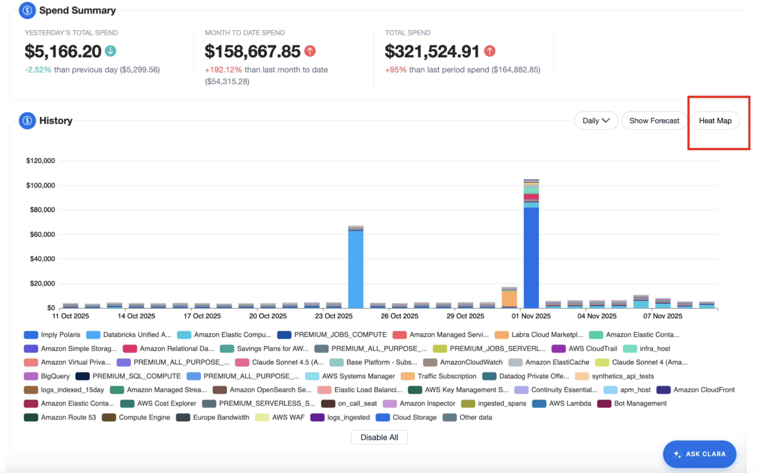
Understanding where your cloud costs are concentrated shouldn’t require multiple clicks or manual data reshaping. The new Heat Map view in nOps provides an immediate, visual way to pinpoint high-spend areas across accounts, services, regions, and other key dimensions—helping you decide where to investigate or optimize next.
Traditional tables made it hard to answer questions like “Which accounts or instance types are driving spend in a given region?” The Heat Map solves this by giving users a color-coded, dynamic visualization that highlights hotspots instantly.
What's New
Heat Map is now available in nOps Explorer. This feature uses a new high-performance API purpose-built for rapid visual cost exploration.
Configurable Heat Map
The new Heat Map visualization makes it easy to see where your cloud spend is concentrated by comparing any two key dimensions—such as product/service by account or instance type by region.
Each cell is color-coded to reflect spend intensity, giving you an instant, visual summary of where your highest costs are concentrated.
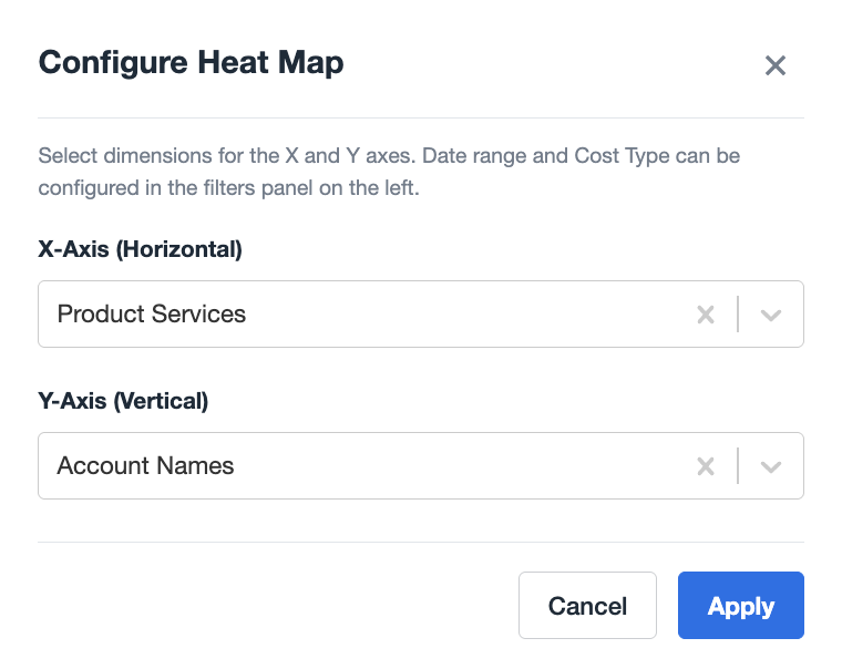
You can reconfigure the axes to explore different cost relationships—for example, switching to Instance Type × Region to understand compute distribution. Hover over any cell for precise spend details, or use the settings icon to adjust dimensions and access inline documentation.
Who Benefits Most
| Cloud Cost Managers | FinOps Practitioners | Engineering Leads |
| Identify where the largest costs originate across environments and accounts. | Quickly visualize which services or regions contribute most to spend, enabling focused optimization. | Use at-a-glance cost distribution to align workloads with utilization and scaling strategies. |
How It Works
- Navigate to any Explorer view where the Heat Map is available.
- Click on the Heat Map button from the Explorer graph section.
- The system loads cost data by the default dimension and secondary axis (e.g., Product Service × Account Name).
- Modify axes via the settings icon to explore alternative relationships.
- Hover over tiles to see detailed cost values.
Note:
- Heat Map visualizations are ephemeral and not saved when creating reports.
- Forecasting is automatically disabled when Heat Map mode is active, but you may use the Cost Type and Date Filter to adjust the data.
How to Get Started
If you're already on nOps...
Have questions about the new Heat Map? Need help getting started? Our dedicated support team is here for you. Simply reach out to your Customer Success Manager or visit our Help Center. If you’re not sure who your CSM is, send our Support Team a message.
If you’re new to nOps…
nOps was recently ranked #1 with five stars in G2’s cloud cost management category, and we optimize $2+ billion in cloud spend for our customers.
Join our customers using nOps to understand your cloud costs and leverage automation with complete confidence by booking a demo with one of our AWS experts.
Last Updated: February 4, 2026, Cloud Management
Tags
Last Updated: February 4, 2026, Cloud Management